The graphs within ColourSpace provide a high level of feedback on the calibration status of any display, including traditional 2D charts as well as unique volumetric 3D graphs, all fully interactive, sizeable, colour coded for dE errors, including error Tangent lines.
Double clicking any point within any graph will select the given point, updating the Manual Measure window data, and enable the pop-up Point Info dialogue window.
Additionally, direct point editing is available in higher ColourSpace license levels.
Reading ColourSpace Graphs
The graphs within ColourSpace provide a high level of feedback on the calibration status of any display, including traditional 2D charts as well as unique volumetric 3D graphs, all fully interactive, sizeable, colour coded for dE errors, including error Tangent lines. Double clicking any point within any graph will select the given point, updating the Manual Measure window data, and enable the pop-up Point Info dialogue window. Additionally, direct point editing is available in higher ColourSpace license levels.
Note: When a single point is selected, all other Tangent lines will be dimmed. Setting a colour value that has not been measured will make all Tangent lines bright.
Within the various CIE and 3D graphs the points are colour-coded to quickly define dE errors, with the default being Green showing points that have a sub-1 dE, Orange showing points are between 1 and 2.3 dE, and Red showing points are above 2.3 dE.
Using Ctrl + Left Click of the Graph Icon, each graph can be cloned-out of the main Profiling window multiple times, enabling user defined layouts to be configured and different graphs to be viewed simultaneously, single graphs made full screen size, or any combination of different graphs and sizes.
CIE Graphs
The Tangent Lines in the CIE graphs show the direction and numerical xy or uv value of any error. Double clicking any point will select the given point, updating the Manual Measure window data, and enable the pop-up Point Info dialogue window. Additionally, direct point editing is available in higher ColourSpace license levels.
The selected point is indicated by a white surround circle within the 2D CIE graphs, and by a cross within the 3D graphs.
Note: When a single point is selected, all other Tangent lines will be dimmed. Setting a colour value that has not been measured will make all Tangent lines bright.


The above 2D CIE graph shows the selected point error as a xy offset, with the Tangent line defining where the colour value should be, compared to the actual measurement. The error is shown only in 2 dimensions, purely as a gamut error.
In comparison, the 3D CIE graphs show the same selected point, with the Tangent line this time defining the associated Luma error component, as the Tangent line shows both horizontal as well as vertical error.
Within the 3D CIE graphs a purely vertical Tangent line indicates a Luma error, which a purely horizontal line indicated a Gamut error, with a diagonal Tangent line showing a combination error.
The Targets option within Graph Options, Overlay, reverses the graph Tangent line displays, as well as showing the actual location, and colour, of each measured point.
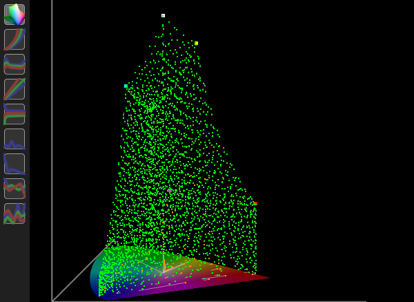
Cube Graphs
The Cube graphs can initially be a little more difficult to interpret, but actually provide a high level of useful information on any display calibration.
A good way to initially start to assess the Cube graphs is to rotate the cube to place it on end, like a diamond, with the black point at the bottom, and the white at the top.


The first Cube graph shows a Grey, Primary & Secondary profile, with each colour axis (R,G,B,C,M,Y) plotted from black to 100% colour.
(It can be beneficial to watch the plots being generated during the Primary & Secondary profiling.)
The second Cube graph shows a plot of all main axis, with each primary and secondary colour plotted for each edge axis, as well as between black and white.
(The graphs are displayed in Target Only mode, so show the actual patch values.)


Luma error Tangent lines are plotted along an axis extending from the black point, through the measured colour point, as shown in the first graph above, which plots a profile that has a higher luma than the Target colour space.
Gamut error Tangent lines are plotted on an axis from the grey scale, through the measured colour point, as shown in the second graph above, which plots a profile that has a low gamut compared to the Target colour space.
Understanding the above makes it possible to read the Cube graphs regardless of their orientation.
EOTF Graphs
The two EOTF graphs should be used together to help define any EOTF (Gamma) errors, as well as the secondary Absolute Error options.
The EOTF graphs plot the grey scale against the defined colour space EOTF, including any luminance errors, while the Dif EOTF graph plots just EOTF errors.
Note: EOTF values are not related to Luma values, which is a common misconception.
EOTF values are effectively inverted as to the effect any error has on the displayed image - a high EOTF value will generally generate a darker image, and a low EOTF value will generate a brighter image.
Note: The use of the term 'generally' is important, as the EOTF values for individual points within an EOTF plot can be substantially different to the overall EOTF, and not follow the above rule-of-thumb, especially with Extended Range calibration, with plots above 100%.


The EOTF graph above shows the profile has a peak luma error compared to the target colour space, as well as lifted (brighter) gamma in the shadows, and low (darker) gamma in the mid's and highlights (specifically in the blue channel) - with the peak luma error appearing to show a high (lifted) gamma, which is not technically correct, as it is a high peak luma.
(Technically, the Zero and 100% points have no EOTF/Gamma value.)
The Absolute Error option for the EOTF graph plots absolute luma errors, relative to the target Min/Max Luma.
The Dif EOTF is a relative graph, and doesn't include luma errors. However, the plot backs-up the gamma errors shown in the EOTF graph, with lifted gamma in the shadows, and low gamma in the mid's and highlights (specifically in the blue channel).


Plotting luma errors as part of the EOTF graph is needed, as for true calibration the target colour space should always be the default standard, and not use the display's measured Min/Max luma values. The Dif EOTF graph is a relative graph, so doesn't include luma errors.
The zero and 100% points of the Dif EOTF graph are not plotted, as the points have no effective EOTF/Gamma value.
The Absolute Error option for the Dif EOTF graph plots absolute luma errors, relative to the target Min/Max Luma, in stops.
As an example of how the graphs work, the following is a synthetic Rec709 profile that is totally accurate, other than the Peak final Luma point is 0.5 nits too high.


As can be seen, the combined graphs are used to define exactly what the error is, with the Dif EOTF appearing to show a gamma error throughout the whole range, as it is a relative graph, while the EOTF graph show the error is just the final peak measurement.
RGB Separation
The RGB Separation graph shows the individual RGB channels compared to the grey scale, with a poor graph effectively showing display cross-coupling errors and/or luma/grey scale errors.
(The graphs plots luma errors for RGB vs the equivalent grey value, based on the black value of the profile.)
With a good display, the RGB values necessary to generate a specific colour of grey should be totally independent, such that any change made to any RGB value to correct the grey colour will be equally correct throughout the whole volumetric colour space.
This defines a decoupled (or non-decoupling) display, where any change made to any RGB channel has no effect on the other channels.
Another way to think of this is from the display's screen perspective. Each pixel is made up of three sub-pixels R, G, and B. If one sub-pixel is sent a stimulus value to change its brightness, the other two sub-pixels should not change at all. If one, or both, of the other sub pixels change, there is cross-coupling happening within the display, and the display is not decoupled.
If the individual R, G, and B channels have different EOTFs there will obviously be a luma difference between each colour channel, also causing a bad RGB Separation plot. Any inaccurate grey scale values, compared to the equivalent RGB values, will also cause a bad RGB Separation plot.

The above RGB Separation graph shows a display with hue/saturation errors within each RGB channel - with each channel error being of a different value.
With a Hue error, altering just the R input stimulus will have an effect on the G and B output from the display, with the same happening for a G or B only input change, causing alterations in the other two channel outputs.
If the hue/saturation error was consistent across all 3 channels, the RGB Separation graph plots would show all three RGB lines overlapping, equally offset from the target diagonal line.
With a saturation error, changing the RGB input input stimulus will have a greater effect on grey, with a lesser effect on the separate RGB outputs, again showing as a RGB Separation error.
Grey scale errors will cause the RGB Separation plot to vary from unity, depending on the deviation of each grey scale point from the expected value.
LG WOLEDs show how the addition of the white sub-pixel causes RGB Separation issues as brightness increases, as the individual RGB sub pixels no longer equal the much brighter grey patch, as it is artificially booted by the white sub-pixel. The individual RGB channels suffer desaturation and a relative drop in luma as brightness increases.

For the RGB Separation graph to plot and make valid sense the profile must have the same patches within the Primary RGB patch sequences as within the Grey sequence.
RGB Balance
While the RGB Balance graph is one of the simplest to read, as it displays the grey scale colour accuracy, independently of any luma errors, it is not necessarily as simple as it looks.
The graph uses the target colour space to define the error ratio of R, G, and B when the grey scale is not perfect. Therefore targeting Rec709 vs Rec2020 or P3 D65 will show different error plots, based on the target colour space selected, even though they all target the same white point.
Changing between different target colour spaces with the same gamut, but different EOTFs, such as Rec709 vs, sRGB, or BT1886 will not cause any change in the RGB Balance graph.

RGB Balance takes the current measurement and the current colour space target, and reverse calculates the target's RGB code value that would have actually produced the measured colour. The graph then plots the comparison of the current patch RGB value to the calculated RGB value.
In essence, the RGB Balance graph shows is how much magnitude adjustment of the RGB analogue gains of the display would be required to correct the measured value, and that varies dependent on the target colour space.
The graph plot Y Axis is therefore RGB Measured minus RGB Target, assuming normalised values.
The above graph shows a display with a blue backlight (which is common for most LCD displays), and which can't be corrected without increasing the black level, that becomes neutral grey at around 10% brightness.
The Absolute Error option for the RGB Balance graph plots the ratio of actual measured values to the target values, so includes luminance variations. Therefore, changing the target colour space EOTF will vary the Absolute Error plot.


The second Absolute Error graph shows the same profile, but targeting sRGB with its 2.2 EOTF, vs the profile's Rec709 2.4 EOTF.
The RGB Balance Absolute Error plotting takes the actual measurements and scales for min and max luminance, based on the current target colour space. The scaled values are compared to their corresponding values calculated from the target colour space. The graph then plots the measured values vs target values, as a ratio. A positive value indicates a measurement that is too bright, and a negative value too dim.
Delta-E
The delta-E graphs provide a quick view of the accuracy of the Grey Scale and All measured profile points.
Both delta-E graphs reference the Target Min/Max Luma values defined within setting.


The Grey Scale dE graph shows the dE value for every measured point in the grey scale. The lower the plotted line, the better the grey scale calibration accuracy.
The dE Distribution graph shows the number of measured points that have dE values within the displayed range. The further to the left, narrower, and taller, the graph plot, the better the results.
Clip
The Clip graph shows the rate of change for grey scale RGB Channel luminance, based on the target colour space EOTF, white point, with the zero line based on the target Min/Max luma Min/Max luma.

Rate of change is a relative value, which means a mismatch of EOTF/Gamma between the Target colour space and the profile will show as a sloping plot, while different Min/Max luma values will show as a global offset of the plot.
Drift
The Drift graph plots the RGB luma values for any drift patched measured during profiling. The zero line is the average of all patches, and any variation from that is shown as a plot deviation in nits.
The Drift data is specifically designed to be used to help define the optimum Patch Sets, Pre-roll, Stabilisation, and Drift patches themselves, to best minimise any Drift during profiling. Additionally, Drift data can be used when generating a LUT by applying offsets to the real patch measured data according to the localised drift measurements.


The first graph shows a display that is heat-cycling during profiling, combined with a full profile cycle cool to warm drift, especially with green. The relatively high-frequency heat cycle variations will cause issues with the accuracy of any generated LUT, and would require a lot of Drift Patches in the original profile to accurately manage the LUT calibration.
The second graph shows a more standard drift plot, with a small full cycle variation, with the displays starting with a cool colour temperature, and ending warmer.
The effect of Drift on Profile data can also be seen by enabling the Drift tick box within the Processing section of the Graphs Options menu.
Note: If a profile is re-saved from the Graph Options menu with the Drift option enabled, the new saved profile will have Drift processing burnt-in to the profile data, as well as still having the original Drift Data attached to the profile.